Prism Resourceswebo2021-04-14T23:04:15+05:30


Resources
Explore our educational resources to advance your knowledge of Prism, statistics and data visualization.
Prism Video Tutorials
Prism 9 Tutorials
Getting Started in Prism
Graphing Basics Series
Essential Statistics
Prism 8 tutorials


Explore the Knowledgebase
What is the difference between ordinal, interval and ratio variables? Why should I care?webo2020-11-27T09:56:54+05:30
In the 1940s, Stanley Smith Stevens introduced four scales of measurement: nominal, ordinal, interval, and ratio. These are still widely used today as a way to describe the characteristics of a variable. Knowing the scale of measurement for a variable is an important aspect in choosing the right statistical analysis.
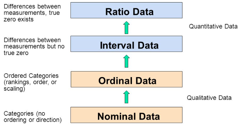
Nominal
A nominal scale describes a variable with categories that do not have a natural order or ranking. You can code nominal variables with numbers if you want, but the order is arbitrary and any calculations, such as computing a mean, median, or standard deviation, would be meaningless.
Examples of nominal variables include:
-
genotype, blood type, zip code, gender, race, eye color, political party
Ordinal
An ordinal scale is one where the order matters but not the difference between values.
Examples of ordinal variables include:
-
socio economic status (“low income”,”middle income”,”high income”), education level (“high school”,”BS”,”MS”,”PhD”), income level (“less than 50K”, “50K-100K”, “over 100K”), satisfaction rating (“extremely dislike”, “dislike”, “neutral”, “like”, “extremely like”).
Note the differences between adjacent categories do not necessarily have the same meaning. For example, the difference between the two income levels “less than 50K” and “50K-100K” does not have the same meaning as the difference between the two income levels “50K-100K” and “over 100K”.
Make more informed and accurate analysis choices with Prism. Start your free Prism trial.
Interval
An interval scale is one where there is order and the difference between two values is meaningful.
Examples of interval variables include:
-
temperature (Farenheit), temperature (Celcius), pH, SAT score (200-800), credit score (300-850).
Ratio
A ratio variable, has all the properties of an interval variable, and also has a clear definition of 0.0. When the variable equals 0.0, there is none of that variable.
Examples of ratio variables include:
-
enzyme activity, dose amount, reaction rate, flow rate, concentration, pulse, weight, length, temperature in Kelvin (0.0 Kelvin really does mean “no heat”), survival time.
When working with ratio variables, but not interval variables, the ratio of two measurements has a meaningful interpretation. For example, because weight is a ratio variable, a weight of 4 grams is twice as heavy as a weight of 2 grams. However, a temperature of 10 degrees C should not be considered twice as hot as 5 degrees C. If it were, a conflict would be created because 10 degrees C is 50 degrees F and 5 degrees C is 41 degrees F. Clearly, 50 degrees is not twice 41 degrees. Another example, a pH of 3 is not twice as acidic as a pH of 6, because pH is not a ratio variable.
Learn more about the difference between nominal, ordinal, interval and ratio data with this video by NurseKillam
|
OK to compute…. |
Nominal |
Ordinal |
Interval |
Ratio |
|
Frequency distribution |
Yes |
Yes |
Yes |
Yes |
|
Median and percentiles |
No |
Yes |
Yes |
Yes |
|
Add or subtract |
No |
No |
Yes |
Yes |
|
Mean, standard deviation, standard error of the mean |
No |
No |
Yes |
Yes |
|
Ratios, coefficient of variation |
No |
No |
No |
Yes |
Does measurement scale matter for data analysis?
Knowing the measurement scale for your variables can help prevent mistakes like taking the average of a group of zip (postal) codes, or taking the ratio of two pH values. Beyond that, knowing the measurement scale for your variables doesn’t really help you plan your analyses or interpret the results.
Note that sometimes, the measurement scale for a variable is not clear cut. What kind of variable is color? In a psychological study of perception, different colors would be regarded as nominal. In a physics study, color is quantified by wavelength, so color would be considered a ratio variable. What about counts?
There are occasions when you will have some control over the measurement scale. For example, with temperature, you can choose degrees C or F and have an interval scale or choose degrees Kelvin and have a ratio scale. With income level, instead of offering categories and having an ordinal scale, you can try to get the actual income and have a ratio scale. Generally speaking, you want to strive to have a scale towards the ratio end as opposed to the nominal end.
Save time performing statistical analysis with Prism. Try Prism for free.
Test your understanding of Nominal, Ordinal, Interval, and Ratio Scales
Each scale is represented once in the list below.
- Favorite candy bar
- Weight of luggage
- Year of your birth
- Egg size (small, medium, large, extra large, jumbo)
Each scale is represented once in the list below.
- Military rank
- Number of children in a family
- Jersey numbers for a football team
- Shoe size
Answers: N,R,I,O and O,R,N,I
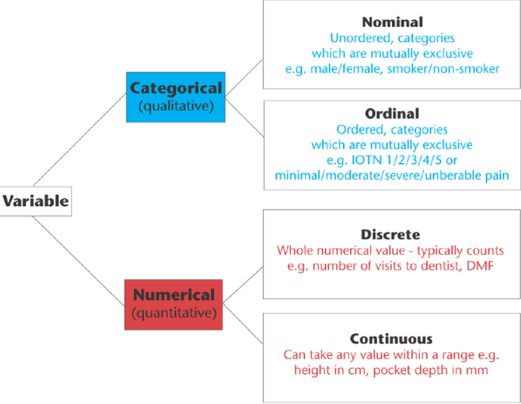
Quantitative (Numerical) vs Qualitative (Categorical)
There are other ways of classifying variables that are common in statistics. One is qualitative vs. quantitative. Qualitative variables are descriptive/categorical. Many statistics, such as mean and standard deviation, do not make sense to compute with qualitative variables. Quantitative variables have numeric meaning, so statistics like means and standard deviations make sense.
This type of classification can be important to know in order to choose the correct type of statistical analysis. For example, the choice between regression (quantitative X) and ANOVA (qualitative X) is based on knowing this type of classification for the X variable(s) in your analysis.
Quantitative variables can be further classified into Discrete and Continuous. Discrete variables can take on either a finite number of values, or an infinite, but countable number of values. The number of patients that have a reduced tumor size in response to a treatment is an example of a discrete random variable that can take on a finite number of values. The number of car accidents at an intersection is an example of a discrete random variable that can take on a countable infinite number of values (there is no fixed upper limit to the count).
Continuous variables can take on infinitely many values, such as blood pressure or body temperature. Even though the actual measurements might be rounded to the nearest whole number, in theory, there is some exact body temperature going out many decimal places That is what makes variables such as blood pressure and body temperature continuous.
It is important to know whether you have a discrete or continuous variable when selecting a distribution to model your data. The Binomial and Poisson distributions are popular choices for discrete data while the Gaussian and Lognormal are popular choices for continuous data.
Test your understanding of Discrete vs Continuous
The list below contains 3 discrete variables and 3 continuous variables:
- Number of emergency room patients
- Blood pressure of a patient
- Weight of a patient
- Pulse for a patient
- Emergency room wait time rounded to the nearest minute
- Tumor size
Answers: d,c,c,d,d,c
Note, even though a variable may discrete, if the variable takes on enough different values, it is often treated as continuous. For example, most analysts would treat the number of heart beats per minute as continuous even though it is a count. The main benefit of treating a discrete variable with many different unique values as continuous is to assume the Gaussian distribution in an analysis.
What does it mean when some results have e in the number?webo2020-11-27T10:02:46+05:30
In the 1940s, Stanley Smith Stevens introduced four scales of measurement: nominal, ordinal, interval, and ratio. These are still widely used today as a way to describe the characteristics of a variable. Knowing the scale of measurement for a variable is an important aspect in choosing the right statistical analysis.
Nominal
A nominal scale describes a variable with categories that do not have a natural order or ranking. You can code nominal variables with numbers if you want, but the order is arbitrary and any calculations, such as computing a mean, median, or standard deviation, would be meaningless.
Examples of nominal variables include:
-
genotype, blood type, zip code, gender, race, eye color, political party
Ordinal
An ordinal scale is one where the order matters but not the difference between values.
Examples of ordinal variables include:
-
socio economic status (“low income”,”middle income”,”high income”), education level (“high school”,”BS”,”MS”,”PhD”), income level (“less than 50K”, “50K-100K”, “over 100K”), satisfaction rating (“extremely dislike”, “dislike”, “neutral”, “like”, “extremely like”).
Note the differences between adjacent categories do not necessarily have the same meaning. For example, the difference between the two income levels “less than 50K” and “50K-100K” does not have the same meaning as the difference between the two income levels “50K-100K” and “over 100K”.
Make more informed and accurate analysis choices with Prism. Start your free Prism trial.
Interval
An interval scale is one where there is order and the difference between two values is meaningful.
Examples of interval variables include:
-
temperature (Farenheit), temperature (Celcius), pH, SAT score (200-800), credit score (300-850).
Ratio
A ratio variable, has all the properties of an interval variable, and also has a clear definition of 0.0. When the variable equals 0.0, there is none of that variable.
Examples of ratio variables include:
-
enzyme activity, dose amount, reaction rate, flow rate, concentration, pulse, weight, length, temperature in Kelvin (0.0 Kelvin really does mean “no heat”), survival time.
When working with ratio variables, but not interval variables, the ratio of two measurements has a meaningful interpretation. For example, because weight is a ratio variable, a weight of 4 grams is twice as heavy as a weight of 2 grams. However, a temperature of 10 degrees C should not be considered twice as hot as 5 degrees C. If it were, a conflict would be created because 10 degrees C is 50 degrees F and 5 degrees C is 41 degrees F. Clearly, 50 degrees is not twice 41 degrees. Another example, a pH of 3 is not twice as acidic as a pH of 6, because pH is not a ratio variable.
Learn more about the difference between nominal, ordinal, interval and ratio data with this video by NurseKillam
|
OK to compute…. |
Nominal |
Ordinal |
Interval |
Ratio |
|
Frequency distribution |
Yes |
Yes |
Yes |
Yes |
|
Median and percentiles |
No |
Yes |
Yes |
Yes |
|
Add or subtract |
No |
No |
Yes |
Yes |
|
Mean, standard deviation, standard error of the mean |
No |
No |
Yes |
Yes |
|
Ratios, coefficient of variation |
No |
No |
No |
Yes |
Does measurement scale matter for data analysis?
Knowing the measurement scale for your variables can help prevent mistakes like taking the average of a group of zip (postal) codes, or taking the ratio of two pH values. Beyond that, knowing the measurement scale for your variables doesn’t really help you plan your analyses or interpret the results.
Note that sometimes, the measurement scale for a variable is not clear cut. What kind of variable is color? In a psychological study of perception, different colors would be regarded as nominal. In a physics study, color is quantified by wavelength, so color would be considered a ratio variable. What about counts?
There are occasions when you will have some control over the measurement scale. For example, with temperature, you can choose degrees C or F and have an interval scale or choose degrees Kelvin and have a ratio scale. With income level, instead of offering categories and having an ordinal scale, you can try to get the actual income and have a ratio scale. Generally speaking, you want to strive to have a scale towards the ratio end as opposed to the nominal end.
Save time performing statistical analysis with Prism. Try Prism for free.
Test your understanding of Nominal, Ordinal, Interval, and Ratio Scales
Each scale is represented once in the list below.
- Favorite candy bar
- Weight of luggage
- Year of your birth
- Egg size (small, medium, large, extra large, jumbo)
Each scale is represented once in the list below.
- Military rank
- Number of children in a family
- Jersey numbers for a football team
- Shoe size
Answers: N,R,I,O and O,R,N,I
Quantitative (Numerical) vs Qualitative (Categorical)
There are other ways of classifying variables that are common in statistics. One is qualitative vs. quantitative. Qualitative variables are descriptive/categorical. Many statistics, such as mean and standard deviation, do not make sense to compute with qualitative variables. Quantitative variables have numeric meaning, so statistics like means and standard deviations make sense.
This type of classification can be important to know in order to choose the correct type of statistical analysis. For example, the choice between regression (quantitative X) and ANOVA (qualitative X) is based on knowing this type of classification for the X variable(s) in your analysis.
Quantitative variables can be further classified into Discrete and Continuous. Discrete variables can take on either a finite number of values, or an infinite, but countable number of values. The number of patients that have a reduced tumor size in response to a treatment is an example of a discrete random variable that can take on a finite number of values. The number of car accidents at an intersection is an example of a discrete random variable that can take on a countable infinite number of values (there is no fixed upper limit to the count).
Continuous variables can take on infinitely many values, such as blood pressure or body temperature. Even though the actual measurements might be rounded to the nearest whole number, in theory, there is some exact body temperature going out many decimal places That is what makes variables such as blood pressure and body temperature continuous.
It is important to know whether you have a discrete or continuous variable when selecting a distribution to model your data. The Binomial and Poisson distributions are popular choices for discrete data while the Gaussian and Lognormal are popular choices for continuous data.
Test your understanding of Discrete vs Continuous
The list below contains 3 discrete variables and 3 continuous variables:
- Number of emergency room patients
- Blood pressure of a patient
- Weight of a patient
- Pulse for a patient
- Emergency room wait time rounded to the nearest minute
- Tumor size
Answers: d,c,c,d,d,c
Note, even though a variable may discrete, if the variable takes on enough different values, it is often treated as continuous. For example, most analysts would treat the number of heart beats per minute as continuous even though it is a count. The main benefit of treating a discrete variable with many different unique values as continuous is to assume the Gaussian distribution in an analysis.
Why use n-1 when calculating a standard deviation?webo2020-11-27T10:04:41+05:30
How ito calculate the standard deviation
1. Compute the square of the difference between each value and the sample mean.
2. Add those values up.
3. Divide the sum by n-1. This is called the variance.
4. Take the square root to obtain the Standard Deviation.
Why n-1?
Why divide by n-1 rather than n in the third step above? In step 1, you compute the difference between each value and the mean of those values. You don’t know the true mean of the population; all you know is the mean of your sample. Except for the rare cases where the sample mean happens to equal the population mean, the data will be closer to the sample mean than it will be to the true population mean. So the value you compute in step 2 will probably be a bit smaller (and can’t be larger) than what it would be if you used the true population mean in step 1. To make up for this, divide by n-1 rather than n.v This is called Bessel’s correction.
But why n-1? If you knew the sample mean, and all but one of the values, you could calculate what that last value must be. Statisticians say there are n-1 degrees of freedom.
When should the SD be computed with a denominator of n?
Statistics books often show two equations to compute the SD, one using n, and the other using n-1, in the denominator. Some calculators have two buttons.
The n-1 equation is used in the common situation where you are analyzing a sample of data and wish to make more general conclusions. The SD computed this way (with n-1 in the denominator) is your best guess for the value of the SD in the overall population.
If you simply want to quantify the variation in a particular set of data, and don’t plan to extrapolate to make wider conclusions, then you can compute the SD using n in the denominator. The resulting SD is the SD of those particular values. It makes no sense to compute the SD this way if you want to estimate the SD of the population from which those points were drawn. It only makes sense to use n in the denominator when there is no sampling from a population, there is no desire to make general conclusions.
The goal of science is always to generalize, so the equation with n in the denominator should not be used. The only example I can think of where it might make sense is in quantifying the variation among exam scores. But much better would be to show a scatterplot of every score, or a frequency distribution histogram.
GraphPad Prism and InStat always compute the SD with the n-1 denominator.
What you can conclude when two error bars overlap (or don’t)webo2020-11-27T10:06:22+05:30
It is tempting to look at whether two error bars overlap or not, and try to reach a conclusion about whether the difference between means is statistically significant.
Resist that temptation (Lanzante, 2005)!
SD error bars
SD error bars quantify the scatter among the values. Looking at whether the error bars overlap lets you compare the difference between the mean with the amount of scatter within the groups. But the t test also takes into account sample size. If the samples were larger with the same means and same standard deviations, the P value would be much smaller. If the samples were smaller with the same means and same standard deviations, the P value would be larger.
When the difference between two means is statistically significant (P < 0.05), the two SD error bars may or may not overlap. Likewise, when the difference between two means is not statistically significant (P > 0.05), the two SD error bars may or may not overlap.
Knowing whether SD error bars overlap or not does not let you conclude whether difference between the means is statistically significant or not.
SEM error bars
SEM error bars quantify how precisely you know the mean, taking into account both the SD and sample size. Looking at whether the error bars overlap, therefore, lets you compare the difference between the mean with the precision of those means. This sounds promising. But in fact, you don’t learn much by looking at whether SEM error bars overlap.
By taking into account sample size and considering how far apart two error bars are, Cumming (2007) came up with some rules for deciding when a difference is significant or not. But these rules are hard to remember and apply.
Here is a simpler rule:
If two SEM error bars do overlap, and the sample sizes are equal or nearly equal, then you know that the P value is (much) greater than 0.05, so the difference is not statistically significant. The opposite rule does not apply. If two SEM error bars do not overlap, the P value could be less than 0.05, or it could be greater than 0.05. If the sample sizes are very different, this rule of thumb does not always work.
Confidence interval error bars
Error bars that show the 95% confidence interval (CI) are wider than SE error bars. It doesn’t help to observe that two 95% CI error bars overlap, as the difference between the two means may or may not be statistically significant.
Useful rule of thumb: If two 95% CI error bars do not overlap, and the sample sizes are nearly equal, the difference is statistically significant with a P value much less than 0.05 (Payton 2003).
With multiple comparisons following ANOVA, the signfiicance level usually applies to the entire family of comparisons. With many comparisons, it takes a much larger difference to be declared “statistically significant”. But the error bars are usually graphed (and calculated) individually for each treatment group, without regard to multiple comparisons. So the rule above regarding overlapping CI error bars does not apply in the context of multiple comparisons.
Rules of thumb (for when sample sizes are equal, or nearly equal).
|
Type of error bar |
Conclusion if they overlap |
Conclusion if they don’t overlap |
|
SD |
No conclusion |
No conclusion |
|
SEM |
P > 0.05 |
No conclusion |
|
95% CI |
No conclusion |
P < 0.05 |
Unequal sample sizes
This page was updated 4/16/2010 to point out that the rules of thumb are true only when the sample sizes are equal, or nearly equal.
Here is an example where the rule of thumb about confidence intervals is not true (and sample sizes are very different).
Sample 1: Mean=0, SD=1, n=10
Sample 2: Mean=3, SD=10, n=100
The confidence intervals do not overlap, but the P value is high (0.35).
And here is an example where the rule of thumb about SE is not true (and sample sizes are very different).
Sample 1: Mean=0, SD=1, n=100, SEM=0.1
Sample 2: Mean 3, SD=10, n=10, SEM=3.33
The SEM error bars overlap, but the P value is tiny (0.005).
References
Cumming et al. Error bars in experimental biology. J Cell Biol (2007) vol. 177 (1) pp. 7-11
Lanzante. A Cautionary Note on the Use of Error Bars. Journal of Climate (2005) vol. 18 pp. 3699-3703
Payton et al. Overlapping confidence intervals or standard error intervals: what do they mean in terms of statistical significance?. J Insect Sci (2003) vol. 3 pp. 34
How to report P values in journalswebo2020-11-27T10:11:52+05:30
When you write up your results, how should you report P values?
Don’t overemphasize P values
A few pointers:
- Consider emphsizing the effect size and confidence interval, rather than a P value. The effect size can be a difference or a ratio or a correlation coefficient (or something else) and all can be reported with a 95% confidence interval to demonstrate how precisely you have determined the effect size. This is more useful, in many cases, than P values.
- Don’t just say if the P value is greater or less than 0.05 (or some other value). If you can, give the P value as a number.
- With multiple comparisons, it is not possible to give individual P values for each comparison, but it is possible in many cases to report multiplicity adjusted P values.
- If you computed many P values, show them all. At a mimunum, state the number of comparisons you made. Performing many analyses on your data and then just reporting the comparisons that result in a small P value will create misleading results.
- It doesn’t help to report a P value unless you clearly state what test was used to compute it.
Asterisks?
Many people add asterisks to tables and graphs to show how low the P value is. The standards for one to three asterisks are quite standard (<0.05, <0.01, <0.001), and both the NEJM and APA agree. Prism (since 5.04/d) will also show four asterisks when the P value is less than 0.0001.
| P value | 0.04 | 0.009 | 0.0009 | 0.00009 |
| APA | * | ** | *** | *** |
| NEJM | * | ** | *** | *** |
| GP Prism up to 5.04/d | * | ** | *** | *** |
| GP Prism 5.04/d and later | * | ** | *** | **** |
Make sure it is clear what null hypothesis the P value is testing
Every P value tests a null hypothesis, so your readers need to be sure what the P value is testing. If you put an asterisk on a graph, ti has to be clear exactly what comparison was made.
Issues that copy editiors care about (but scientists don’t)
How many digits to report? Leading zero or not?
How exactly should P values be reported? Three styles are summarized below:
| P value | 0.1234 | 0.01234 | 0.00123 | 0.00012 | 0.00001 |
|---|---|---|---|---|---|
| APA | “.123” | “0.012” | “.001” | “<.001” | “<.001” |
| NEJM | “0.12” | “0.012” | “0.001” | “<.001” | “<.001” |
| GP | “0.1234” | “0.0123” | “0.0012” | “0.0001” | “<0.0001” |
The Americal Psychological Association (APA) has published an extensive style guide used for publishing in the social sciences. One rule is to not include the zero before the decimal point when reporitng a P value: “There are some values that by definition can never exceed 1.0. The omission of the leading zero is a visual indicator of this restricted range. The most common cases are p values and correlations.”. They also state to report two or three digits after the decimal point. The P value in the first column of the table is shown as “.123” in APA style, but you could read their style to mean “.12”.
The New England Journal of Medicine (NEJM) states: “Except when one-sided tests are required by study design, such as in noninferiority trials, all reported P values should be two-sided. In general, P values larger than 0.01 should be reported to two decimal places, those between 0.01 and 0.001 to three decimal places; P values smaller than 0.001 should be reported as P<0.001. Notable exceptions to this policy include P values arising in the application of stopping rules to the analysis of clinical trials and genetic-screening studies.”
We never intended to create a style, but GraphPad (GP) programs are in wide use, so many people follow our lead. GraphPad InStat and Prism always report a zero before the decimal point, and four digits after. If the P value is less than 0.0001, we report “<0.0001”.
“P value” or “p value”
There is no uniform style.
The APA suggest “p value” The p is lowercase and italicized, and there is no hyphen between “p” and “value”.
GraphPad has adapted the style “P value”, which is used by the NEJM and journals. The P is upper case and not italicized, and there is no hyphen between “P” and “value”.
Sometimes, you see “p-value”. Note the hyphen.
Is it better to plot graphs with SD or SEM error bars? (Answer: Neither)webo2020-11-27T10:13:02+05:30
There are better alternatives to graphing the mean with SD or SEM.
If you want to show the variation in your data:
If each value represents a different individual, you probably want to show the variation among values. Even if each value represents a different lab experiment, it often makes sense to show the variation.
With fewer than 100 or so values, create a scatter plot that shows every value. What better way to show the variation among values than to show every value? If your data set has more than 100 or so values, a scatter plot becomes messy. Alternatives are to show a box-and-whiskers plot, a frequency distribution (histogram), or a cumulative frequency distribution.
What about plotting mean and SD? The SD does quantify variability, so this is indeed one way to graph variability. But a SD is only one value, so is a pretty limited way to show variation. A graph showing mean and SD error bar is less informative than any of the other alternatives, but takes no less space and is no easier to interpret. I see no advantage to plotting a mean and SD rather than a column scatter graph, box-and-wiskers plot, or a frequency distribution.
Of course, if you do decide to show SD error bars, be sure to say so in the figure legend so no one will think it is a SEM.
If you want to show how precisely you have determined the mean:
If your goal is to compare means with a t test or ANOVA, or to show how closely our data come to the predictions of a model, you may be more interested in showing how precisely the data define the mean than in showing the variability. In this case, the best approach is to plot the 95% confidence interval of the mean (or perhaps a 90% or 99% confidence interval).
What about the standard error of the mean (SEM)? Graphing the mean with an SEM error bars is a commonly used method to show how well you know the mean, The only advantage of SEM error bars are that they are shorter, but SEM error bars are harder to interpret than a confidence interval.
Whatever error bars you choose to show, be sure to state your choice. Noticing whether or not the error bars overlap tells you less than you might guess.
If you want to create persuasive propaganda:
If your goal is to emphasize small and unimportant differences in your data, show your error bars as SEM, and hope that your readers think they are SD
If our goal is to cover-up large differences, show the error bars as the standard deviations for the groups, and hope that your readers think they are a standard errors.
This approach was advocated by Steve Simon in his excellent weblog. Of course he meant it as a joke. If you don’t understand the joke, review the differences between SD and SEM.
How to create a 100% stacked column graphwebo2020-11-27T10:14:21+05:30
Excel uses the term “100% stacked column” graph to refer to a stacked bar graph, where the sum of all the slices is 100.
Prism 6 lets you make that graph in two ways.
- As a parts of whole graph. Parts of whole data are often plotted as pie charts, but Prism lets you show it as a stack if you want (horizontal or vertical). When plotted this way, Prism doesn’t show any axis, so you get a visual sense of the division with no numbers (unless you ask Prism to superimpose each percentage value on each slice). A parts of whole graph plots data you entered into one column (without any subcolumns). If you want your graph to have several stacks, you’ll need to make them individually, and then combine them on a layout.
- As a stacked bar graph. This is generally a better approach, as it lets you create several stacks in one graph. Enter data onto a Grouped table. Each row in the table becomes one stack in the graph. If you enter the data so the values sum to 100, you can plot these directly. If your values don’t sum to 100, Prism can normalize them so they do. Don’t use the Normalize analysis. Instead use the “Fraction of total” analysis (new to Prism 6) and choose to divide each value by its row total and report the results as percentages. Then plot the results.

The attached Prism file shows several examples.
If you use Prism 5, you’ll need to use the second approach above. There is no Fraction of Total analysis, so you’ll need to figure out how to do the math using Normalize, Transform, Row means, or Remove baseline analyses.
How do I transpose columns and rows of a Prism data table?webo2020-11-27T10:16:24+05:30
Transposing means that every row becomes a column, and every column becomes a row. There are three ways to transpose in Prism.
- From the data table, click “Analyze”, then choose “Transpose” from the list of data manipulations. The transposed data will be on a new results table.
- Copy a block of data to the clipboard (from Prism or another program). Put the insertion point into the upper left corner of the block where you want the data to go. Choose “Paste Transpose” from the Edit menu or from the shortcut menu you see when you right click.
- When importing data, you can choose to Transpose in the Placement tab of the Import dialog.
Perhaps you don’t want to transpose, but want to swap the X and Y columns. This is possible via the Transform analysis.
Graph tip – How can I plot an odds ratio plot, also known as a Forest plot, or a meta-analysis plot?webo2020-11-27T10:18:22+05:30
Graph tip – How can I plot an odds ratio plot, also known as a Forest plot, or a meta-analysis plot?

This example shows how to make an odds ratio plot, also known as a Forest plot or a meta-analysis plot, graphs odds ratios (with 95% confidence intervals) from several studies. It also shows how to place a custom grid line on a graph.
How to do it:
GraphPad Prism can make this kind of graph easily.
- When you start the program, or use New table/graph to create a Column data table. Keep the default choice to enter the “replicates” into columns. (In this case, they are not replicates, but Prism thinks they are).
- Enter the data. Enter in each column the Odds ratio itself, as well as the high and low confidence limits (computed elsewhere). Each treatment group should be entered in a separate column, and you’ll enter three values in each column (the odds ratio, and the lower and upper confidence limits). The order of those three values doesn’t matter. Label the groups by entering column titles. You may use Greek symbols, super and subscript, etc. This example plots results from three studies, but use columns D, E, F, etc. to plot results from more studies.

- Click on the Graphs tab.
- Choose the thumbnail for how you want your graph to look. Also choose to plot the median and range since the median of the three values you entered is the middle one, the odds ratio, and the range of the three values you entered will cover the confidence interval computed elsewhere.
- View the graph.
- The default graph is vertical. To make the graph horizontal (as below), double click on the graph to bring up Format Graph, and go to the third tab.
- Some metaanalysis plots use larger symbols to denote studies with more subjects. Prism can’t do this automatically. But you can adjust the size of each symbol in the Format Graph dialog, so make some larger and some smaller.
- Edit the graph and axis titles, add an additional custom line (actually a dotted line) at X=1.0 (from Format Axes dialog as shown below), and you are done.


Epidemiologists often like to make the x axis logarithmic. This makes sense as it makes odd ratios greater than 1.0 and less than 1.0 symmetrical (for example, an odds ratio of 2.0 becomes symmetrical with an odds ratio of 0.5).
This is easy to do with Prism. Format the X axis with a Log 10 scale and set the range from 0.1 to 10 with “antilog” numbering and a grid line at X=1.


Download this file to see how this graph was made.
Keywords: horizontal error bars odd’s ratio metanalysis meta metaanalysis Forrest
What is the meaning of * or ** or *** in reports of statistical significance from Prism or InStat?webo2020-11-27T10:56:49+05:30Starting with Prism 8, Prism allows you to choose which decimal format Prism will use to report P values (information on previous versions of Prism can be found below). Each analysis that computes P values gives you four choices:
Choose P value Format
- APA (American Psychological Association) style, which shows three digits but omits the leading zero (.123). P values less than 0.001 shown as “< .001”. All P values less than 0.001 are summarized with three asterisks, with no possibility of four asterisks.
- NEJM (New England Journal of Medicine) style, which shows three digits and includes the leading zero (0.123). P values less than 0.001 shown as “< .001”. All P values less than 0.001 are summarized with three asterisks, with no possibility of four asterisks.
- GraphPad style which reports four digits after the decimal point with a leading zero (0.1234). P values less than 0.0001 shown as “< .0001”. P values less than 0.001 are summarized with three asterisks, and P values less than 0.0001 are summarized with four asterisks.
- Choose how many digits you want to see after the decimal point, up to 15. P values less than 0.001 are given three asterisks, and P values less than 0.0001 are given four asterisks.
Symbol Meaning ns P > 0.05 * P ≤ 0.05 ** P ≤ 0.01 *** P ≤ 0.001 **** P ≤ 0.0001 (For the last two choices only)
Note that the first two choices (APA and NEJM) show at most three asterisks (***) and the last two choices will show four asterisks with tiny P values (****).
The multiple t test analysis is different than all the rest. In earlier versions of the software (Prism 6), the “Significant?” column would display a single asterisk if the t test for that row is statistically significant, given your setting for alpha and the correction for multiple comparisons. Prism would either places a single asterisk in that column or leaves it blank. It would never places more than one asterisk. In this column, current versions of Prism simply write “Yes” or “No” depending on if the test corresponding to that row was found to be statistically significant or not.
Note a possible misunderstanding. Prism 8.0-8.2 presents the choices for P value formatting like this:
The P values shown are examples. It shows one P value presented as “.033”, or as “0.033”, or as “0.0332” depending on the choice you made (note the difference in the number of digits and presence or absence of a leading zero). Some people have misunderstood this to mean that we define a single asterisk to mean P<0.0332. But of course, we use the standard definition of <0.05. We’ll find a way to make these choices less confusing in a future release.
The ANOVA table (SS, df, MS, F) in two-way ANOVAwebo2020-11-27T10:20:01+05:30
You can interpret the rsults of two-way ANOVA by looking at the P values, and especially at multiple comparisons. Many scientists ignore the ANOVA table. But if you are curious in the details, this page explains how the ANOVA table is calculated.
Example
I entered data with two rows, three columns, and three side-by-side replicates per cell. No missing values. So 18 values entered in all. Prism file.
I analyzed the data four ways: assuming no repeated measures, assuming repeated measures with matched values stacked, assuming repeated measures with matched values spread across a row, and with repeated measures in both directions. The tables below are color coded to explain these designs. Each color within a table represents one subject. The colors are repeated between tables, but this means nothing.
.png)
Here are the ANOVA tables for the four conditions. These values are all reported by Prism. I rearranged and renamed a bit so the four can be shown on one table (Excel file).

Sum-of-squares
Focus first on the sum-of-squares (SS) column with no repeated measures:
- The first row shows the interaction of rows and columns. It quantifies how much variation is due to the fact that the differences between rows are not the same for all columns. Equivalently, it quantifies how much variation is due to the fact that the differences among columns is not the same for both rows.
- The second row show the the amount of variation that is due to systematic differences between the two rows.
- The third row show the the amount of variation that is due to systematic differences between the columns.
- The second to the last row shows the variation not explained by any of the other rows. This is called residual or error.
- The last row shows the total amount of variation among all 18 values.
Now look at the SS columns for the analyses of the same data but with various assumptions about repeated measures.
- The total SS stays the same. This makes sense. This measures the total variation among the 18 values.
- The SS values for the interaction and for the systematic effects of rows and columns (the top three rows) are the same in all four analyses.
- The SS for residual is smaller when you assume repeated measures, as some of that variation can be attributed to variation among subjects. In the final columns, some of that variation can also be attributed to interaction between subjects and either rows or columns.
Degrees of freedom
Now look at the DF values.
- The total DF (bottom row) is 17. This is the total number of values (18) minus 1. It is the same regardless of any assumptions about repeated measures.
- The df for interaction equals (Number of columns – 1) (Number of rows – 1), so for this example is 2*1=2. This is the same regardless of repeated measures.
- The df for the systematic differences among rows equals number of rows -1, which is 1 for this example. This is the same regardless of repeated measures.
- The df for the systematic differences among columns equals number of columns -1, whiich is 2 for this example. It is the same regardless of repeated measures.
- The df for subjects is the number of subjects minus number of treatments. When the matched values are stacked, there are 9 subjects and three treatments, so df equals 6. When the matched values are in the same row, there arr 6 subjects treated in two ways (one for each row), so df is 4. When there are repeated measures for both factors, this value equals the number of subjects (3) minus 1, so df=2.
Details on how the SS and DF are computed can be found in Maxwell and Delaney (reference below). Table 12.2 on page 576 explains the ANOVA table for repeated measures in both factors. But note they use the term “A x B x S” where we say “Residual”. Table 12.16 on page 595 explains the ANOVA table for repeated measures in one factor. They say “B x S/A” where Prism says “residual”, and say “S/A” where Prism says “subject”.
Mean squares
Each mean square value is computed by dividing a sum-of-squares value by the corresponding degrees of freedom. In other words, for each row in the ANOVA table divide the SS value by the df value to compute the MS value.
F ratio
Each F ratio is computed by dividing the MS value by another MS value. The MS value for the denominator depends on the experimental design.
- For two-way ANOVA with no repeated measures: The denominator MS value is always the MSresidual.
- For two-way ANOVA with repeated measures in one factor (p 596 of Maxwell and Delaney):
- For interaction, the denominator MS is MSresidual
- For the factor that is not repeated measures, the denominator MS is MSsubjects
- For the factor that is repeated measures, the denominator MS is MSresidual
- For two-way ANOVA with repeated measures in both factors (p 577 of Maxwell and Delaney): The MS for the denominator is the MS for the interaction of the factor being tested with subjects.
- For Row Factor, the denominator MS is for Interaction of Row factor x Subjects
- For Column Factor, the denominator MS is for Interaction of Column factor x Subjects
- For the Interaction:Row Factor x Column Factor, the denominator MS is for Residuals (also called the interaction of Row x Column x Subjects)
P values
Each F ratio is computed as the ratio of two MS values. Each of those MS values has a corresponding number of degrees of freedom. So the F ratio is associated with one number of degrees of freedom for the numerator and another for the denominator. Prism reports this as something like: F (1, 4) = 273.9
Calculting a P value from F and the two degrees of freedom can be done with a free web calculator or with the =FDIST(F, dfn, dfd) Excel formula
Multiple comparisons
The details of multiple comparisons are explained in this document.
How to compare two means when the groups have different standard deviations.webo2020-11-27T10:21:58+05:30
The t test assumes equal variances
The standard unpaired t test (but not the Welch t test) assumes that the two sets of data are sampled from populations that have identical standard deviations, and thus identical variances, even if their means are distinct.
Testing whether two groups are sampled from populations with equal variances
As part of the t test analysis, Prism tests this assumption using an F test to compare the variance of two groups. Note that a bug in earlier versions of Prism and InStat gave a P value for the F test that was too small by a factor of two.
Don’t mix up the P value testing for equality of the standard deviations of the groups with the P value testing for equality of the means. That latter P value is the one that answers the question you most likely were thinking about when you chose the t test or one-way ANOVA. The P value that tests for equality of variances answers this question:
If the populations really had identical standard deviations, what is the chance of observing as large a discrepancy among sample standard deviations as occurred in the data (or an even larger discrepancy)?
What to do if the variances differ
If the P value is small, you reject the null hypothesis that both groups were sampled from populations with identical standard deviations (and thus identical variances).
Then what?
There are five possible answers.
- Conclude that the populations are different. In many experimental contexts, the finding of different standard deviations is as important as the finding of different means. If the standard deviations are different, then the populations are different regardless of what the t test concludes about differences between the means. Before treating this difference as a problem to workaround, think about what it teslls you about the data. This may be the most important conclusion from the experiment! Also consider whether the group with the larger standard deviation is heterogeneous. If a treatment was applied to this group, perhaps it only worked on about half of the subjects.
- Transform your data. In many cases, transforming the data can equalize the standard deviations. If that works, you can then run the the t test on the transformed results. Logs are especially useful. (See Chapter 46 of Intuitive Biostatistics for an example). The log transform is appropriate when data are sampled from a lognormal distribution. In other situations, a reciprocal or square root transform may prove useful. Ideally, of course, the transform should have been planned as part of the experimental design.
- Ignore the result. With equal, or nearly equal, sample size (and moderately large samples), the assumption of equal standard deviations is not a crucial assumption. The t test work pretty well even with unequal standard deviations. In other words, the t test is robust to violations of that assumption so long as the sample size isn’t tiny and the sample sizes aren’t far apart. If you want to use ordinary t tests, run some simulations with the sample size you are actually using and the difference in variance you are expecting, to see how far off the t test results are.
- Go back and rerun the t test, checking the option to do the Welch t test that allows for unequal variance. While this sounds sensible, Moser and Stevens (1) have shown that it isn’t. If you use the F test to compare variances to decide which t test to use (regular or Welch), you will have increased your risk of a Type I error. Even if the populations are identical, you will conclude that the populations are different more than 5% of the time. Hayes and Cai reach the same conclusion (2). The Welch test must be specified as part of the experimental design.
- Use a permuation test. No GraphPad program offers such a test. The idea is to treat the observed values as a given, and to ask about the distribution of those values to the two groups. Randomly shuffle the values between the two groups, maintaining the original sample size. What fraction of those shuffled data sets have a difference between means as large (or larger) than observed. That is the P value. When the populations have different standard deviations, this test still produces reasonably accurate P values (Good, reference below, page 55). The disadvantage of these tests is that they don’t readily yield a confidence interval. Learn more in Wikipedia, or Hyperstat.
What about switching to the nonparametric Mann-Whitney test? At first glance, this seems to be a good solution to the problem of unequal standard deviations. But it isn’t! The Mann-Whitney test tests whether the distribution of ranks is different. If you know the standard deviations are different, you already know that the distributions are different. What you may still want to know is whether the means or medians are distinct. But when the groups have different distributions, nonparametric tests do not test whether the medians differ. This is a common misunderstanding.
How to avoid the problem
None of the solutions above are great. It is better to avoid the problem.
One approach to avoiding the problem is to think clearly about the distribution of your data, and transform the data as part of routine data processing. If you know a system creates lognormal data, analyze the logarithms always.
Another solutions is to use the unequal variance (Welch) t test routinely. As mentioned above, it is not a good idea to first test for unequal standard deviations, and use that results as the basis to decide whether to use the ordinary or modified (unequal variance, Welch) t test. But does it make sense to always use the modified test? Ruxton suggests that this is the best thing to do (3). You lose some power when the standard deviations are, in fact, equal but gain power in the cases where they are not.
The Welch t test makes a strange set of assumptions. What would it mean for two populations to have the same mean but different standard deviations? Why would you want to test for that? Swailowsky points out that this situation simply doesn’t often come up in science (4). I prefer to think about the unequal variance t test as a way to create a confidence interval. Your prime goal is not to ask whether two populations differ, but to quantify how far apart the two means are. The unequal variance t test reports a confidence interval for the difference between two means that is usable even if the standard deviations differ.
References
- Moser, B.K. and G.R. StevensHomogeneity of Variance in the Two Sample Means Test, The American Statistician, 1992;46(1):19-22.
- Hayes and Cai.Further evaluating the conditional decision rule for comparing two independent means. Br J Math Stat Psychol (2007)
- Ruxton.The unequal variance t-test is an underused alternative to Student’s t-test and the Mann-Whitney U test. Behavioral Ecology (2006) vol. 17 (4) pp. 688
- S.S. Sawilowsky. Fermat, Schubert, Einstein, and Behrens-Fisher: The Probable Difference Between Two Means With Different Variances. J. Modern Applied Statistical Methods (2002) vol. 1 pp. 461-472
How can I determine an EC90 (or any EC value other than EC50)?webo2020-11-27T10:23:09+05:30
The potency of a drug is commonly quantified as the EC50, the concentration that leads to 50% maximal response (or the logarithm of the EC50). But in some systems you might be more interested in the EC80 or the EC90 or some other value. You can either compute these values from the EC50 or fit a curve in such a way as to directly fit ECanything.
Use a free web calculator
One of our free web calculators does the calculation for you. Enter the EC50 and Hill Slope and it will calculate whatever EC value you want.
ComputingECanythingfrom the EC50
If you’ve already obtained an EC50 value by nonlinear regression in Prism and you don’t need an error estimate, use this equation to determine ECF (where F might be 80 or 90 …) from the EC50 and Hill Slope (H):

(This equation was derived by starting with the equation that defines percent response F, from EC50, H, and concentration, and then rearranging to solve for the concentration (ECF).)
If you know the EC50 and Hill slope (H), you can easily compute the EC80 or EC10 or any other value you want. For example, if the Hill slope equals 1, the EC90 equals the EC50 times nine. If H equals 0.5, the curve is shallower and the EC90 equals the EC50 times 81.
Fitting the ECanything directly using Prism
You can fit data directly to an equation written in terms of the ECF, where F=fraction of maximal response (example: for EC90, F=90). The advantage of this approach is that Prism will report the 95% confidence value for ECF.
The needed equation is built in to Prism starting with version 5. Details.
ICanything
If your response goes down with increasing dose (so the Hill slope is negative), watch out for the terminology. The EC10 (for example) is defined as the concentration that gives you a response 10% of the way between the Bottom and Top plateaus. In situations where the response goes down as you increase dose, you may think of this as the “IC90” since it gives 90% of the maximum inhibition.
Another example. Let’s say you set F=80. Then the ECf for inhibitory data would be the concentration (X value) required to bring the curve down to 80%. If you actually want the concentration that brings the curve down by 80%, to 20%, then you’d need to set F equal to 20.
What if the dose-response curve is incomplete?
When a dose-response curve is incomplete, then the determination of a value on the curve is not accurate. If you can not define the top and bottom plateaus of a curve, then it is not possible to determine other regions of the curve that are defined by their relationship to the top and bottom plateaus. This point is discussed further in a section of FAQ 1356.
What about EC100?
As the concentration (X) goes up, the dose-response equation computes the response (Y) as getting closer and closer to the Top plateau. But it never reaches it. When a drug binds to a receptor with mass action rules, the fraction occupancy equals D/(D+K), where D is the concentration of drug (that you vary) and K is the equilibrium binding dissioction constant, which is a fixed property of the drug and receptor. As D gets higher and higher, the fractional occupancy gets closer and closer to 1.0, but never reaches it. Therefore, there can be no EC100. And no EC0.
For early releases of Prism (or other programs):
If you are using Prism 4 or earlier, you will need to write your own equation. From the table (if you entered your data as log of concentration) or results sheet (if Prism did the log transformation for you), initiate a nonlinear regression analysis. In the “Parameters” dialog, choose “More equations” and then select “[Enter your own equation]” from the list. In the “Equation” dialog, give your equation a name you’ll recognize, then enter this equation set:

Click “Rules for Initial Values” and tell Prism how to derive the initial values for the curve fit. Note that we’re setting up the analysis described under Determining any EC value directly at curvefit.com:

Click “OK” three times to back out of these dialogs and perform the curve fit. Prism displays a results sheet showing the best fit value, the standard error, and the 95% confidence interval for the ECF, or in this case, the EC90.
Here are some additional tips:
- Notice that the equation name will show up among your choices under “More equations” the next time you want to do the analysis.
- If you occasionally want a different ECF, you can edit the equation, changing the value of F.
- If you’re always interested in the same value of F, you can simplify the equations. Here is the simplified equation set for EC90 (note that the results sheet will now explicitly display “logEC90”):
logEC50=logEC90 – (1/HillSlope)*log(9)
Y=Bottom + (Top-Bottom)/(1+10^((LogEC50-X)*HillSlope))
Y=Bottom + (Top-Bottom)/(1+10^((LogEC50-X)*HillSlope))
Of course, you can always set up multiple ECF analyses, based upon different F values, using the simplified equations.
What is the meaning of * or ** or *** in reports of statistical significance from Prism or InStat?webo2020-11-27T10:38:50+05:30Starting with Prism 8, Prism allows you to choose which decimal format Prism will use to report P values (information on previous versions of Prism can be found below). Each analysis that computes P values gives you four choices:
Choose P value Format
- APA (American Psychological Association) style, which shows three digits but omits the leading zero (.123). P values less than 0.001 shown as “< .001”. All P values less than 0.001 are summarized with three asterisks, with no possibility of four asterisks.
- NEJM (New England Journal of Medicine) style, which shows three digits and includes the leading zero (0.123). P values less than 0.001 shown as “< .001”. All P values less than 0.001 are summarized with three asterisks, with no possibility of four asterisks.
- GraphPad style which reports four digits after the decimal point with a leading zero (0.1234). P values less than 0.0001 shown as “< .0001”. P values less than 0.001 are summarized with three asterisks, and P values less than 0.0001 are summarized with four asterisks.
- Choose how many digits you want to see after the decimal point, up to 15. P values less than 0.001 are given three asterisks, and P values less than 0.0001 are given four asterisks.
Symbol Meaning ns P > 0.05 * P ≤ 0.05 ** P ≤ 0.01 *** P ≤ 0.001 **** P ≤ 0.0001 (For the last two choices only)
Note that the first two choices (APA and NEJM) show at most three asterisks (***) and the last two choices will show four asterisks with tiny P values (****).
The multiple t test analysis is different than all the rest. In earlier versions of the software (Prism 6), the “Significant?” column would display a single asterisk if the t test for that row is statistically significant, given your setting for alpha and the correction for multiple comparisons. Prism would either places a single asterisk in that column or leaves it blank. It would never places more than one asterisk. In this column, current versions of Prism simply write “Yes” or “No” depending on if the test corresponding to that row was found to be statistically significant or not.
Note a possible misunderstanding. Prism 8.0-8.2 presents the choices for P value formatting like this:
The P values shown are examples. It shows one P value presented as “.033”, or as “0.033”, or as “0.0332” depending on the choice you made (note the difference in the number of digits and presence or absence of a leading zero). Some people have misunderstood this to mean that we define a single asterisk to mean P<0.0332. But of course, we use the standard definition of <0.05. We’ll find a way to make these choices less confusing in a future release.

